![Image [sc-b8e86e9c-0]](https://static.wixstatic.com/media/2af232_8239a28cb57c4babbf703b130919dd1d~mv2.png/v1/fill/w_980,h_393,al_c,q_90,usm_0.66_1.00_0.01,enc_avif,quality_auto/2af232_8239a28cb57c4babbf703b130919dd1d~mv2.png)
Making Revolut’s analytics dashboard easier to understand for everyday users
Revolut users struggled to make sense of raw transaction data. We redesigned the analytics dashboard to surface meaningful insights across income, spending, budgeting, and travel, helping users make confident financial decisions.
My role
UX researcher
UX/UI designer
Duration
3 weeks
Team
3 UX/UI designers
Revolut has plenty of data but little insights
Revolut is a financial super-app and founded in 2015 in London, it does everything: Spending, saving, investing, multi-currency. But giving everything ≠ giving clarity.
+60 million users
Personal costumers globaly
£1 trillion
annual transaction volume


8M
DAU (daily active users)
Problem
When clarity got lost in the numbers
Revolut users see numbers everywhere, but no clear story of their finances. The real need is not just more data, but clarity: seeing spending patterns, tracking goals, and managing currencies → without feeling overwhelmed.
Numbers everywhere, no big picture.


Desk research
Millions of new users are joining, but many still feel overwhelmed by data
We wanted to understand what makes Revolut’s analytics both inspiring and overwhelming. By reviewing +100 user comments, plus insights from Revolut’s 2024 Annual Report we found a common pattern: admiration for the product, but mental fatigue from too much data.


Feature Inconsistency & Relevance Issues
- Useful features (like “All-time view” or analytics button) suddenly removed.
- Crypto on the main dashboard feels unnecessary for most users.

Cluttered & Overloaded Dashboard
- Too many services shown at once create confusion and overwhelm.
- Ads and promotions on the home screen distract users from core tasks.
- Features feel scattered, not integrated → dashboard lacks clarity.
Information Overload vs. Actionable Insights
- Analytics are descriptive, not prescriptive → too much data, no advice.
- Users feel overwhelmed by numbers, charts, and transactions.
- Missing visualization for financial health tools (e.g., emergency savings).
Lack of Transparency & Trust
- Fees (especially FX on weekends) are unclear → users feel misled.
We excluded areas like trust, support, and fraud detection from this case study, since our research focus was specifically on dashboard clarity and financial insights, the experience most closely tied to Revolut’s core brand promise as a financial super-app.
Research insights
Here are the key highlights of what users are saying about Revolut.
Interview
Seeing the human side of finance
To move past surface feedback, we interviewed eight active users with different financial habits. Their stories revealed small frustrations that added up to a larger emotional burden.

I don’t start budgeting or quit quickly because it’s unclear & time-consuming.
We tried budgeting once, but it took too much time, so we dropped it.

Interview insights
Clues connected, insights revealed
Analytics felt hidden and shallow
Most users didn’t know about Analytics feature (Awareness)
Some users just found the features too basic
offered summaries, not insights → so don’t feel like a real financial tool
Spending insights came too late
Checking the category after spending instead of getting proactive alerts.
Felt unsupported
unable to mange finances in real time
Budgeting felt unclear and discouraging
-
Process lacked guidance → avoided or abandoned budgeting
-
Unertainty → Feel uncnfident & less engaged with app
Currency management felt confusing and error-prone
-
To be sure money comes from the right currency
-
Hesitate to exchange manuall
-
This lack of clarity reduces their trust in the app.
Persona + User journey
People behind the numbers reveal two distinct user types
"I only check my money when I have to."
Passive Tracker
He checks spendings only when money runs out fast, but he checks his analytics once in a while when app sends him notifications of his spending insights once in a while. He mainly uses the daily balance for practical needs like splitting salary or paying rent.
Frustrations
-
Negative reports create stress, and missing accuracy/reminders reduce trust.
-
Information is sometimes inaccurate or missing reminders.

"I want to get the most out of my money, safely and without mistakes."
Active Tracker
They are an active, data-driven user who tracks balances and expenses closely, relies on analytics before spending, and values good exchange rates, zero commission, and transparent plans
Frustrations
-
Expense categories are too broad
-
When the budget is exceeded, the app gives no clear guidance → leads to uncertainty and dropping the goal.
-
Default currency settings are confusing and lead to mistakes in payments

Competitive analysis
What Competitors Do Well, And Where Users Are Still Left Wanting
Revolut competes in a crowded landscape of digital-first finance apps. Direct competitors like Wise, Monzo, and N26 focus on banking and money movement, while Buddy represents the “indirect” space of personal finance management and budgeting. Together, they show where the market is strong and where Revolut has room to differentiate.


Our analysis shows that apps excel in distinct areas:
Multi-currency clarity & transparent FX fees → builds user trust
Strong categorisation & savings features → simplify spending and goal tracking
Clean, minimal summaries → reduce cognitive load for users
Gamified budgeting & collaborative features → increase engagement and motivation
Lack of actionable insights in all apps
-
Most financial and banking apps fail to deliver actionable insights.
-
When insights are offered, they are often shallow and generic.
-
Users rarely get practical guidance they can apply to real financial decisions.


Marc Larsen
30-2-2025
“Tangible saving buckets (Spaces)”
“Clear visual separation between goals”


Impact-effort matrix
Spotting opportunities, framing solutions
From exploring the landscape of possibilities, certain ideas clearly stood out as game-changers. Mapping these ideas against effort and impact revealed where we could create immediate value and where we could innovate for long-term engagement, turning a cluttered dashboard into a space where numbers finally make sense.

UI design
Turning insights into interface
Translating user needs into clear, functional design decisions. Each element of the new dashboard reflects the insights gathered from real user struggles.
There’s so much data in my account. I want someone to help me make sense of it all
I can’t find my total daily spends,
I always find out about things too late, like big spends or being over my budget.

Before

After
Solution
Showing total spendings in the home page
Solution
Adding an AI assistant connected to the bank’s own servers to give users smart insights based on their account activity.
Solution
Adding most recent and important insights first tab in the home page
📈 Impact
Instant Financial Awareness
📈 Impact
-
Increased retention
-
Upsell and cross-sell growth
-
Lower support costs
📈 Impact
Users immediately see relevant information which encourages exploration and follow-up actions.
Is there anyone to help me? should i hire an accountant to know what happens with my financials?
I need more info, something like a quick review to know what happens without digging more
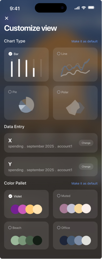
I cant customize my data and charts, I don't like its appearance
Before


After
Solution
Adding a button for customizable elements like chart type, data entry, calendar, and different accounts enhances the chart view experience.
📈
Impact
-
Enhanced Personalization
-
User Empowerment & Engagement
Solution
Showing direct feedback in the bottom of each tab
📈
Impact
-
understanding their financial situation at a glance
-
reducing cognitive effort
-
connecting data points into one clear story.
Solution
Adding a short description to Clarify the purpose of the Sort income
📈
Impact
This shifts it from a generic button to a meaningful feature that connects insights to real financial actions.
Solution
Adding an AI-driven interaction layer that lets users generate personal insights through natural questions.


Solution
Enabling users to personalize their dashboard by choosing chart types, data categories, and colour palettes to create a view that matches their needs and preferences.
📈
Impact
-
Encourages users to connect with their finances on a personal level.
-
Helps users focus on financial insights that matter most to them.
I wish something could tell me what should i do next or where i was acting wrong.
What are all these numbers for? Which one is usefull for me?

Before

After
Solution
Giving users insights about their financial progress
📈 Impact
-
Clarity and Understanding
-
Actionable Guidance
-
Reduced Financial Stress
-
Increases Engagement
I can see how much is left , but I can’t guess will i survive by continue spending like this?
Every time that i set a budget for myself , I can’t hold it until the ending. I usually exceed because I dont know how to manage my budget categories.

Before

After
Solution
Giving hints and insights in budget page depends on the budget’s situation ( in this case the budget is not on track)
📈 Impact
Builds a sense of support and encouragement.
Increases motivation to stay consistent
Higher engagement with budgeting tools and actions

Reflection
The Moment It Clicked
Many people open their Revolut app with good intentions, to check, to plan, to feel in control. But what we found is that numbers alone don’t give people peace of mind.
The most surprising discovery was how hidden analytics were. Users weren’t avoiding insights, they simply didn’t know where to look. That changed our perspective completely.
“Data is powerful only when it tells a story people can understand.”


